Color Psychology in your Website
Color Psychology for your Website
Colors play a vital role in shaping your emotions towards a product, influencing your decision-making process, and impacting how you understand messages.
When beginning a new design project, I spend a lot of time on both color and typography. This is not simply for esthetics, color and fonts invoke feelings and those feelings are important in giving your customers the correct impression of you and your company.
Figuring out which colors work well with others isn’t just a matter of chance. There is a science behind which colors work well together. Color psychology is a fascinating field that explores how colors can impact human behavior, emotions, and perceptions.
Understanding color psychology and the subconscious and subliminal effect of color on the emotions, can help you choose the best choice of colors in the creation of a better website to capture the attention of your visitor, and potential customer, and add meaning, simplicity, clarity and power to your website design.
RED COLOR PSYCHOLOGY

Red is a potent color with a mix of positive and negative meanings. On the bright side, red symbolizes strength, passion, love, and confidence. On the flip side, it can also signify aggression, anger, alertness, or danger. This doesn't mean you should steer clear of red altogether; instead, you can harness both sides of its powerful symbolism to your advantage.
The color red is known to prompt quicker decision-making. Many fast-food brands incorporate red into their color schemes because it triggers a physical reaction, increasing hunger and stimulating the appetite. Moreover, businesses frequently opt for red when promoting sales to create a sense of urgency in their messaging.
ORANGE COLOR PSYCHOLOGY
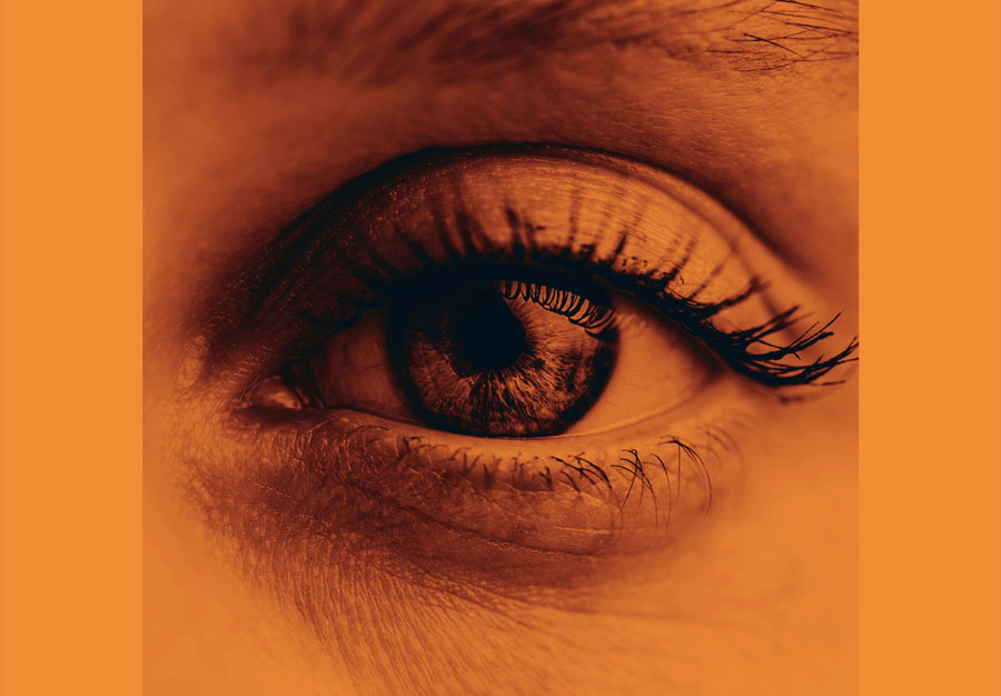
Orange is a highly energetic and vibrant color. In its softer shades, it can be linked to the earth and the autumn season. Due to its connection with seasonal transitions, orange symbolizes change and progress in a broader sense. Additionally, orange is closely tied to creativity.
In design, orange grabs attention without the intensity of red. It is perceived as friendly and welcoming, rather than overly dominant or aggressive.
YELLOW COLOR PSYCHOLOGY

Yellow has a reputation for being the brightest and most invigorating among warm colors, often linked with joy and sunlight. Furthermore, yellow symbolizes hope, evidenced by the display of yellow ribbons in some countries by families with members at war. While yellow hints at danger, it is not as forceful as red in conveying this message.
In the realm of design, bright yellow injects a feeling of happiness and brightness. Milder shades of yellow are often chosen as a gender-neutral option for babies, deviating from the traditional blue or pink. Light yellows evoke a peaceful sense of joy compared to their vibrant counterparts. Dark and golden yellows can impart an antique look and are suitable for designs that aim to convey a sense of permanence.
GREEN COLOR PSYCHOLOGY

Green is a grounded color that symbolizes fresh starts and development, as well as rebirth and prosperity. It shares the calming qualities of blue while adding a touch of yellow's energy. In design, green brings balance, harmony, and stability. It is ideal for projects associated with wealth, stability, rejuvenation, and the environment. Bright greens offer energy and liveliness, while olive greens reflect nature. Dark greens exude stability and affluence.
The specific shade of green you opt for can communicate significantly different messages. Its association with nature can bring an organic and healthful vibe to your natural food brand or yoga studio. Conversely, a brighter green is commonly seen in financial contexts. A more subdued tone can induce a sense of calm and relaxation, while a vibrant green exudes a refreshing and energetic aura.
BLUE COLOR PSYCHOLOGY

Blue is known for its calming, soothing, and friendly qualities. It is a versatile and neutral color choice that can convey both professionalism and approachability depending on the context. With its association with trustworthiness, many brands across various industries use blue to create a positive brand image.
The meaning of blue is widely affected depending on the exact shade and hue. In design, the shade of blue you select will have a huge impact on how your designs are perceived. Light blues are often relaxed and calming. Bright blues can be energizing and refreshing. Dark blues, like navy, are excellent for corporate sites or designs where strength and reliability are important.
PURPLE COLOR PSYCHOLOGY

Purple is an elegant color known for symbolizing loyalty, making it an excellent choice when aiming to establish trust. Besides trust, purple is often associated with mystery. This sophisticated color is typically considered feminine and holds historical connections to royalty and opulence.
While a color's historical connotations shouldn't dictate its usage, it's essential to recognize how deeply rooted or subconscious associations like these can inadvertently impact your intended message.
In design, dark purples can give a sense wealth and luxury. Light purples are softer and are associated with spring and romance.
PINK COLOR PSYCHOLOGY

Many brands targeting feminine audiences incorporate the color pink. This color, both nurturing and playful, evokes feelings of passion, love, and youth. A vibrant hot pink conveys urgency, while a soft, muted pink brings a sense of calmness and neutrality.
Pink serves as a prime illustration of how the meaning of colors can evolve with society. While previously considered a "boy" color, pink is now predominantly linked with femininity.
WHITE COLOR PSYCHOLOGY
White is commonly associated with simplicity, purity, and cleanliness. Frequently utilized to create contrast in designs, white offers a fresh, neutral canvas that prevents overcrowding. White serves the purpose of providing space for other elements and acts as a backdrop to highlight specific features.
White can help to convey cleanliness and simplicity, though, and is popular in minimalist designs. White in designs can also portray either winter or summer, depending on the other design motifs and colors that surround it.
BROWN COLOR PSYCHOLOGY

Neutral and natural, brown has some warmth to it and a feeling of security. It’s a very earthy color that will effortlessly evoke elements from the natural world. If you’re going for an organic, wholesome feel, brown is an excellent color to include in your palette.
Brown is linked with the elements of earth, wood, and stone, representing a completely natural and warm neutral color. It is often connected with qualities like dependability, reliability, steadfastness, and earthiness, although it can also be viewed as dull.
GRAY COLOR PSYCHOLOGY

A genuine neutral tone, gray is typically utilized as a supporting color or accent. It can moderate or enhance any other color, or act as a subtle backdrop, especially suitable for online art displays. Avoid saturating your design entirely in gray, as this may shift the neutrality to a dull and uninteresting result.
Gray is commonly associated with conservatism and formality, yet it can also convey a modern aesthetic. It is sometimes linked with mourning. In corporate settings, where professionalism is crucial, gray is frequently used. It can exude sophistication. While pure grays are variations of black, others may have hints of blue or brown. Gray backgrounds and typography are prevalent in design.
BLACK COLOR PSYCHOLOGY
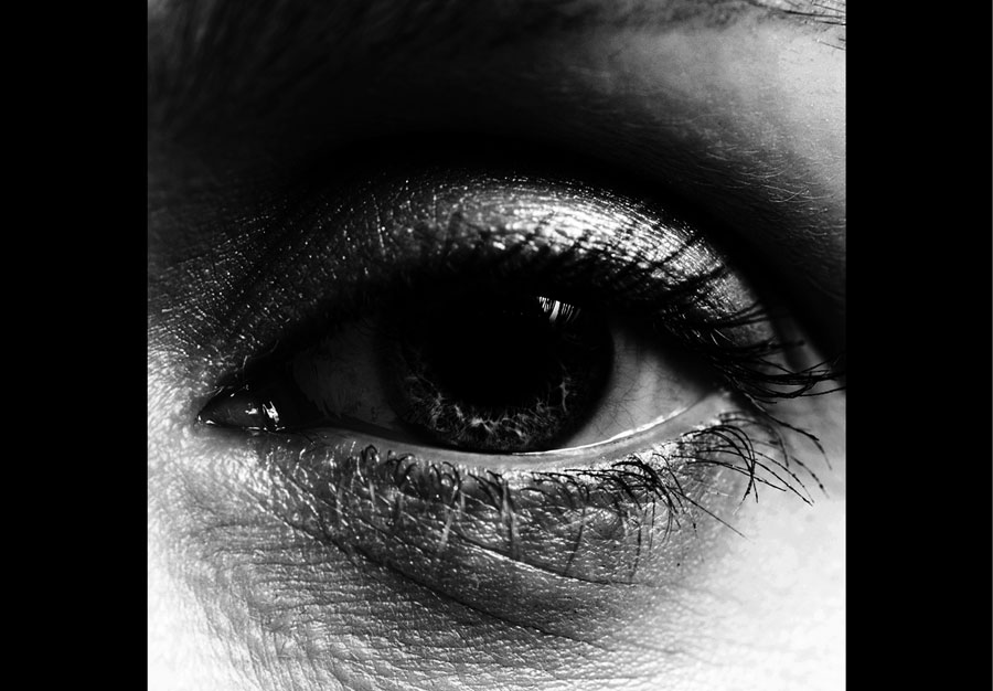
Black is a dominant color that conveys authority and intensity to your message. When applied in moderation, black can elevate the sophistication and simplicity of your design. While black backgrounds are becoming more popular in web design, it is essential to steer clear of creating an excessively dark or weighty interface and to pay attention to text color contrast.
Occasionally, a bold hint of black can deliver your message in a distinctive way. If you want to add a touch of sophistication or seriousness to your design, black is a classic option that always leaves a lasting impression.
While the amount of information provided may feel a bit overwhelming, remember that color psychology is more about the emotions a particular hue conveys than anything else. Here's a concise guide outlining the common meanings associated with the colors mentioned:
Red: Passion, Love, Danger, Strength
Orange: Energy, Happiness, Vitality
Yellow: Happiness, Hope, Deceit
Green: New Beginnings, Abundance, Nature
Blue: Calm, Responsible, Sadness
Purple: Creativity, Royalty, Wealth
Pink: Romantic, Feminine, Love, Sensityivity, Excitement
Black: Mystery, Elegance, Luxury, Power
Gray: Moody, Conservative, Formality
White: Purity, Simple, Minimalism
Brown: Nature, Wholesomeness, Dependability


