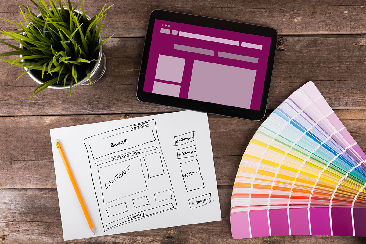
Improve your website with this feedback

improve your website
  1. 48% of people cited a website’s design as the number one factor in deciding the credibility of a business
  2. 94% of people cited a website's design, if poorly planned or designed, as the reason they mistrusted or rejected a website
  3. 72% of people entrusted online reviews just as much as personal recommendations
  4. 40% of people ventured away from a website if it loaded for more than 3 seconds
  5. 44% of mobile users reported that navigating a web page was difficult and 6% complained of difficulties interacting with it
  6. 62% of companies which designed their website(s) for mobile platforms increased their sales and 64% of companies that designed their website for tablets increased sales.
  7. Colors increased web recognition by 80%. Sites with dark color schemes increased growth by 2% whereas sites with lighter color schemes experienced 1.3% growth
  8. 70% of people looked at lists with bullet points. 55% looked at lists without bullet points
  9. 67% of shoppers were more likely to buy from a website that is compatible with mobile devices
  10. 27% of sites use HTML5. Those sites account for 49% of page views

A little bit about fonts …

Selecting the right typeface is a mixture of rules and intuition, and takes years of experience to develop a feeling for the right mixture.

font choice, lois reed designs

For many beginners, the task of picking fonts is a daunting process. There seem to be endless choices — from normal, conventional-looking fonts to grunge and cartoon fonts — with no way of understanding the process, there are only never-ending lists of categories and recommendations.

"Typography is two-dimensional architecture, based on experience and imagination, and guided by rules and readability.

And this is the purpose of typography:

The arrangement of design elements within a given structure should allow the reader to easily focus on the message, without slowing down the speed of his reading."

- Hermann Zapf

What typeface to use, and when

First, my pet-peeve - ALL CAPS.

Capital and lowercase letters:

If the text is set entirely in capital letters, it suffers a loss of legibility. Type set in this manner retards the abilily to read it. Our minds are set to see shapes. This is why we can "read" those blocks of text that are actually not the correct spelling. There are shapes that our minds read, over the letters themselves. IF THE TEXT IS IN ALL CAPS there isn't the shape that there is when the text is lowercase.


Serif or Sans-Serif?

The rule of thumb for print is to use a serif font, the "feet" of the letters help move the eye and keep you on the line. But, just as color is different on a monitor due to the light coming from behind, so is  type. Serifs actually make reading long lines of text more difficult on the screen. For this reason, sans-serif fonts are best used for long blocks of text, while serif fonts are great for headings.

All rules can be broken in great ways, but it is always best to know the rules before breaking them. That said, I have seen some fabulous sites with serif fonts for the paragraphs.

Contrast

Contrast is the main factor in whether or not text is easy to read. Good contrasts will make text easy on the eyes, easy to scan quickly, and overall more readable. On the other hand, poor contrast will force the user to squint and make reading the body text almost painful, not to mention a lot slower.

Black on white is very readable. Black on white is clearly the standard in contrast colors. For readable content it is good to stay in the range of black-on-white contrast.

However, something like purple on blue, is nearly impossible to read. Poor contrast can have a major impact on the text. You probably won’t see websites using this type of contrast, but you need to be aware of it.

Line Height

Line height is a very common term meaning the space between individual lines of text. Line height is another factor in the readability of body text and even headers. Sufficient line height is especially important in Web design because it makes the text easier to scan ... and scan we do! Line height that is too short will cause users to squint while reading. If it is too large, the text will seem like separate bodies instead of grouped together as one.

Letter Spacing

Like line height, letter spacing affects readability in Web typography. Letter spacing is the space between each letter in words. Letter spacing is an obvious factor in legibility.

Line Length

Line length is often overlooked in Web typography but should not be. Line length is, of course, the number of words per line. A good line length is one that allows the reader’s eyes to flow from the end of one line to the beginning of the next very easily and naturally. Aim for a maximum length of around 80 to 100 characters per line, if possible.

For more on web typography readability visit Smashing Magazine's article,  10 Principles Of Readability And Web Typography

Learn: Typeface Classifications

Blackletter: A script style of calligraphy made with a broad-nibbed pen using vertical, curved and angled strokes. Popular from the Middle Ages through the Renaissance (and up to the 20th Century mainly in Germany). Styles are often associated with certain countries or regions. This font is Gothic in style.

Calligraphic: Typefaces based on letters made with a broad-nibbed pen.

Gaelic: was widely used from the 16th until the mid-18th century (Scotland) or the mid-20th century (Ireland) .

Sans Serif: A typeface without serifs.

.

Script: Typefaces based on letters made with a flexible pen or brush, or derivative forms.

Serif: A typeface with serifs.

Pin It on Pinterest